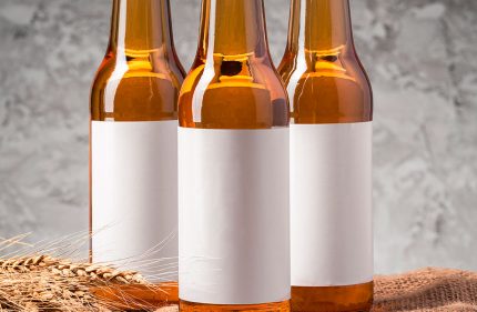
The design of the labels on beverages is everything. To the point that the consumer leans towards one product or another based on its packaging, appearance and visual appeal. Cartoons, the meanings associated with colours, photographs and illustrations represent a toolbox of elements with the mission of turning a can or a bottle into the most attractive and best-selling on the market.
A good design makes a beverage memorable, identifiable and, above all, consumed. If you’re planning to update your packaging and labelling or create a new brand, you need to get up to speed on the latest trends in label design. Continue reading…
Getting people’s attention is key
Studies tell us that we have only 3 to 5 seconds to grab a consumer’s attention during the purchasing process.
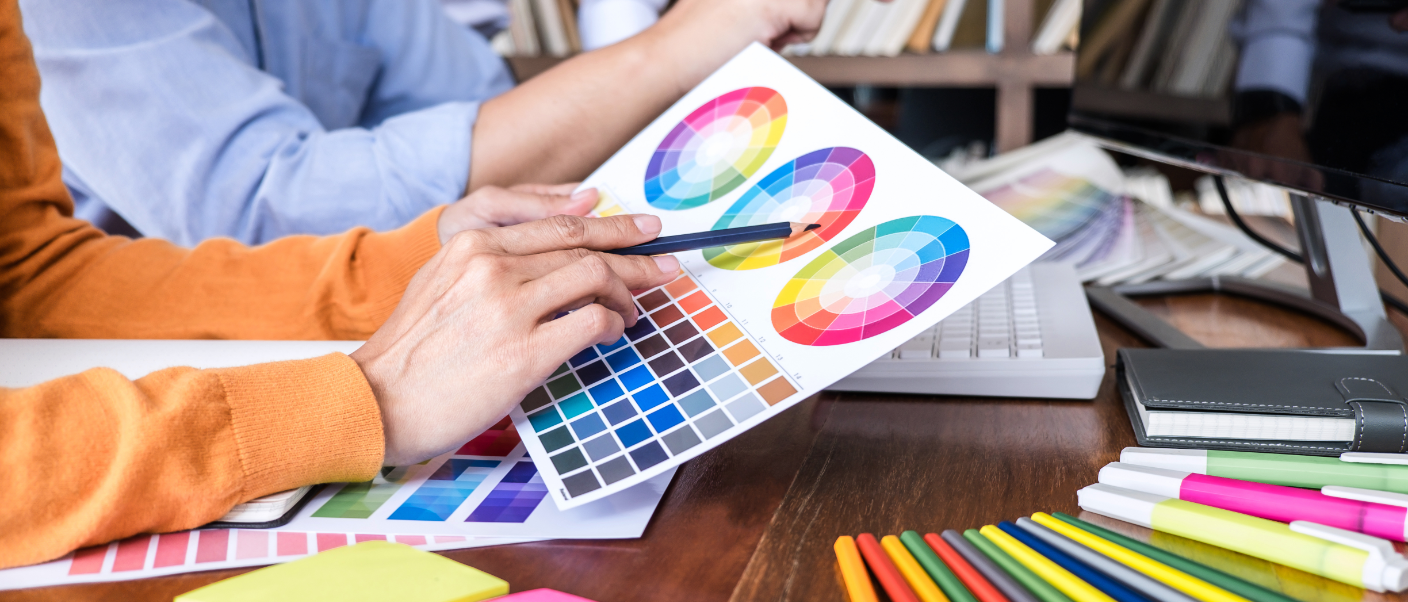
This minimal time should serve as a reference to spur the industry to strive to make a brand competitive, with it being very advisable in these cases to hire a specialized team or a creative agency to help us reflect and materialize the idea together with the brand’s philosophy.
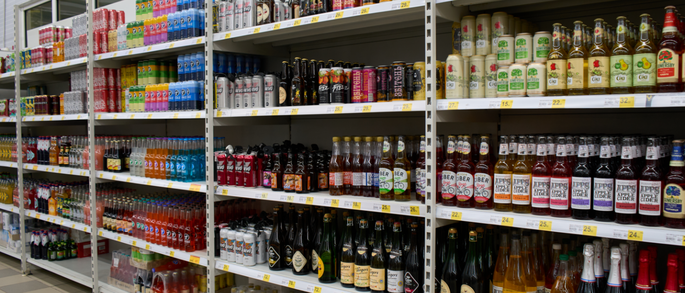
We would do good to remember that some 30,000 new products are launched each year and that, of this number, the vast majority (85%) go unnoticed, with the remaining 15% attracting all the attention.
That makes coming up with a good idea for an attractive label design for bottles and cans important.
How to construct a good label design for your beverage
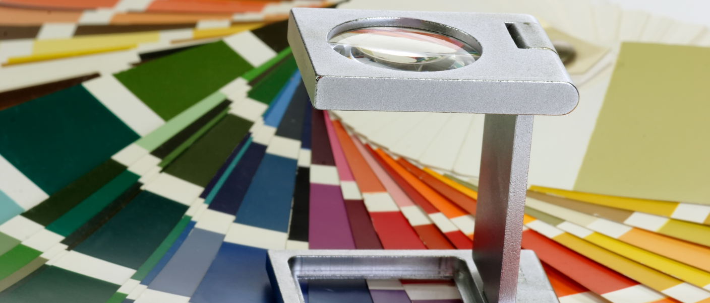
As part of the creative process, it’s very important to analyse the product, the brand, the potential for errors, and current trends to construct a design that’s attractive, modern, cutting-edge and competitive.
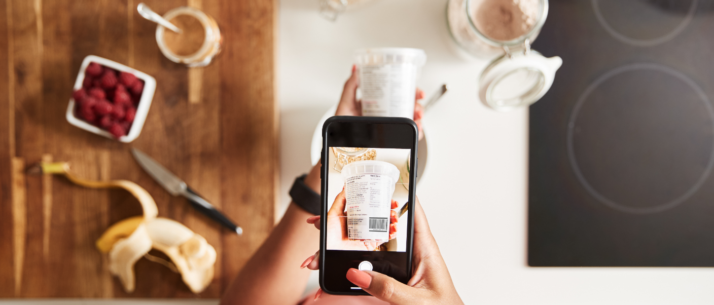
The design for beverage labels can be defined as the creation of an attractive design with clearly written text that displays this useful information as transparently as possible so that it can be understood, while standing out and appealing to the end consumer.
Label design for a beverage is so important that it helps with selection of the product as well to enhance our reputation. It’s an emblem that needs to bring together everything about the brand in a small space.
During the gestation process for the design, there are a series of fundamental aspects that must be considered.
- It has to be brief and readable, so that the consumer can take in all the product information at first glance.
- Pay close attention to the typography. Many products fail because they don’t choose a suitable font. The typography should impact and connect with the brand, in addition to having a wide variety of formats (italics, bold, etc.).
- It’s important to carefully plan the white space around the different elements. That will make the label more readable.
- Labelling has to be, above all, creative.
- Here’s where the help of expert creatives is crucial.
- It’s important to think about the size and dimensions of the product.
- The printing quality. How will the label look once it’s printed?
- It’s important to consider market trends, which we explain below…
Latest trends in label design
Taking into account that the trends and interests are not the same in the case of a beer, a functional beverage, a bottled water and a liquor, those prevailing in the beverage industry right now and for the near future are as follows:
1. Simple, clean, transparent and sustainable designs
In some cases, simplicity stands out. Clean, sustainable designs inspired by transparency are prevailing. Honesty with customers is paramount, and transparency generates connection and engagement with the consumer.
When it comes to designing the label, it’s also important to consider sustainability. We have to think about structures and colours that guide us to create designs that are respectful of the environment and promote good health.
2. Interactive inks
In the current market, there are various types of inks:
- thermochromatic inks, that change colour with the temperature. They’re perfect for showing hidden text or elements through the labelling.
- colour-shifting inks, which change colour according to the angle the product is viewed from. It’s one of the latest trends for transforming and playing with the design of our label.
- sunlight inks, the most in-demand at the moment because they’re invisible until they’re struck directly with ambient light. They’re perfect for hidden messages and limited editions.
3. Embossed and raised designs
Labels with raised elements create a feeling of higher quality and presence on store shelves.
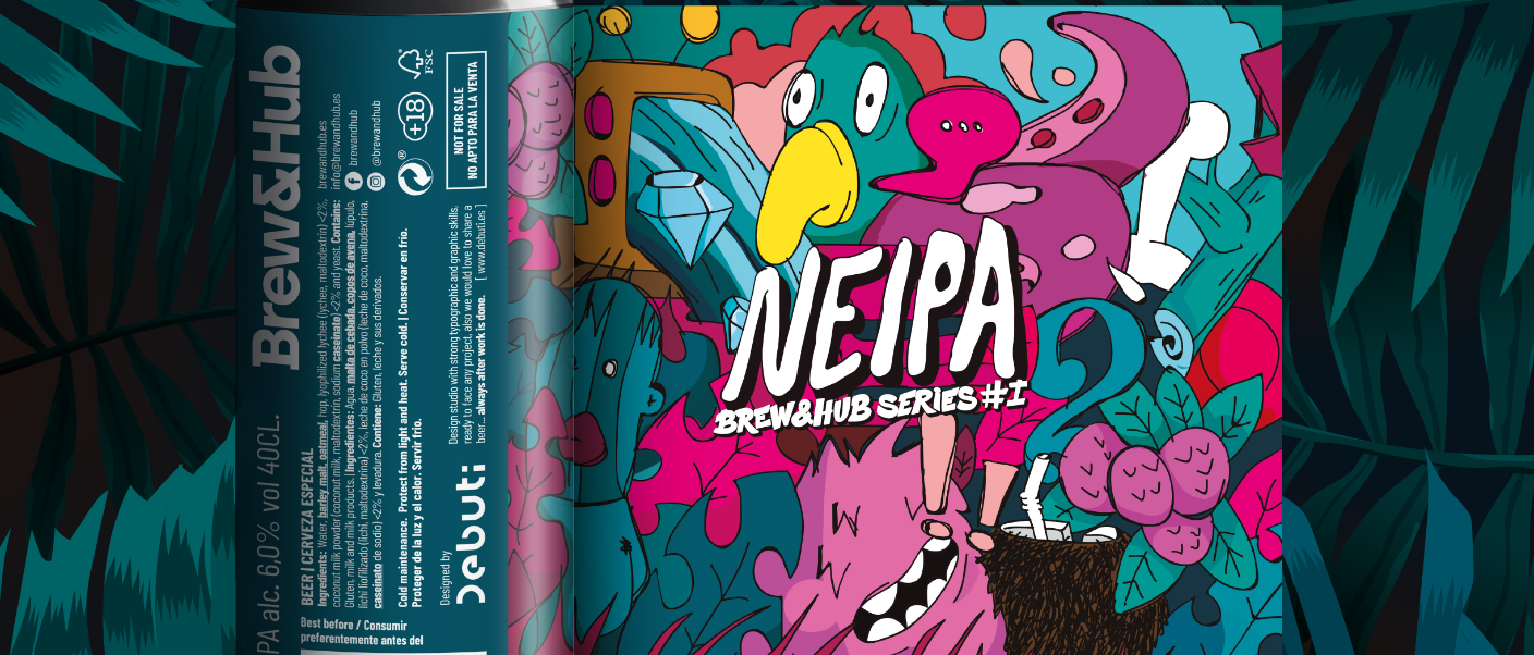
4. Colourful and eye-catching designs
Some beverages seem destined for labels with bold colours, and this type of label tends to lift people’s spirits and arouse their interest. In design it’s essential to use colour psychology, and these types of bright colours are associated with fun, positiveness and good cheer.
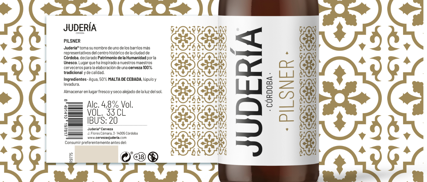
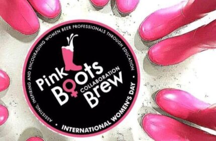
5. Based on the local history or art of the beverage’s place of origin
One of the most common label themes for beverages is the local history or art of a product’s place of origin to convey the values, history, symbolism, etc. of that place. This is the case of Alhambra 1925 from Cervezas Alhambra, which constructed its label and brand by associating those values with the beer. It strengthens the corporate identity
6. Include messages with a touch of humour and witticisms
Phrases or claims with a touch of humour or witticisms that inspire consumption moments help us connect with our audience.
7. Alternating with bold-faced fonts
Although it’s important to use colours and fonts that suit the product’s nature, another strategy being used at the moment in beverage label design is to include bold-faced fonts that stand out because they tend to be better remembered by the consumer.
8. Shading and gradients
Colour gradients on the can or on glass bottles are being used a great deal lately. It’s a technique that makes designs more powerful and adds a modern and cutting-edge touch.
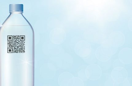
9. Inclusion of a QR code
Especially for the millennial and generation-Z public, which is more familiar with this type of technology. Although including a QR code is becoming indispensable on most products.
The labels for all the products made at Brew&Hub are fully personalized with a wide range of finishes and based on each client’s needs. In addition, with the new validation tool for final art for the packaging components, you can check the production status of products at any time.


Comments